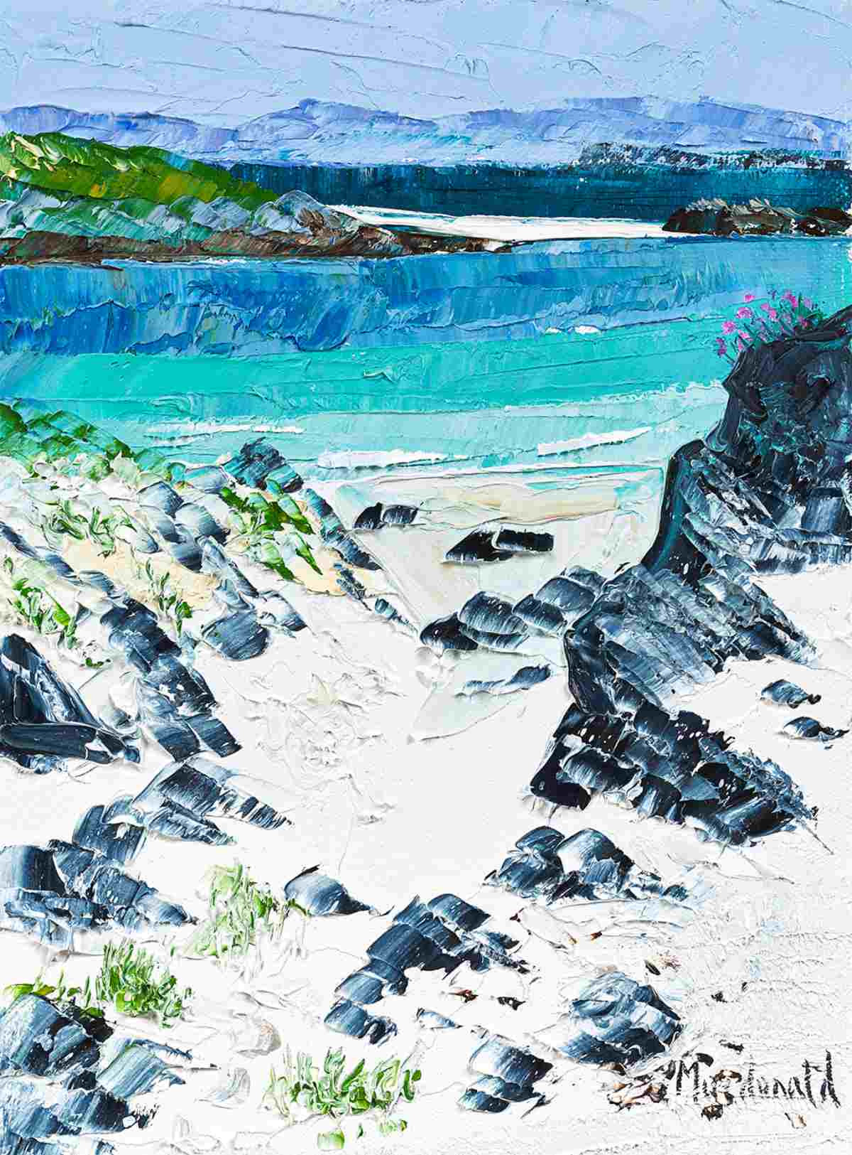
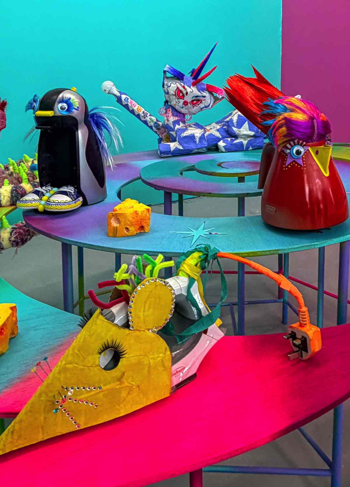
This is the first physical degree show at GSA for three years, and in this past academic year, students have been able to work in the School’s studios again. Visitors can look forward to visiting a great show in person this year.
The show runs until 12th June for all areas other than Architecture, which runs from 11th to 19th June. Much of the work is also available to see at www.gsashowcase.net
I visited the Stow Building for the School of Fine Art show (116 students in BA Fine Art) and the Reid Building for the School of Design show (160 students). The exhibition of further departments – Master of Fine Art, Architecture, Product Design, Simulation and Visualisation, is spread across another four locations: check www.gsashowcase.net for details.
Overall, a highly diverse and excellent show. There is so much to see, it merits a full day, or possibly longer to avoid visual overload! The GSA covers many different disciplines, displaying excellence in areas ranging from Fine Art to Product Design Engineering, however some of the designations in Fine Art can be surprising – for example where the work of a student of Painting & Printmaking involves neither of these techniques.
At the Stow building there is Painting & Printmaking, Fine Art Photography and Sculpture & Environmental Art. Although there is some work that is less well resolved, there is much fine work on display, showing imagination and a high degree of skill in execution. It is evident that many of the students have been very dedicated in their work, producing a large body of high-quality work. Across all the departments seen, it’s evident that a large number of students are embracing environmental concerns, and using recycled and sustainable materials.
 Ben Lingard, ‘The Trees 1’ and ‘The Trees 2’, ink, acrylic and Sharpie on canvas
 Theodore Wilkins-Lang, ‘We Others’, photographic prints on paper
 Yuchen Lu, ‘Untitled’, oil on canvas
Some of my highlights at the Stow building were Ben Lingard’s series of large-scale paintings entitled ‘Into the Trees’, of a new motorway bridge in central Glasgow and the urban environment around it; Theodore Wilkins-Lang in Fine Art Photography, with a series of portraiture ‘We Others’, very striking in black and white; and Yuchen Lu’s oil paintings on canvas, reminiscent of the renaissance painting schools and depicting historical fictional stories.
 Nkem Okwechime, ‘M.R.L.C. Take-over’, prints, clothing, decorated furniture
 Chloe Beddow, ‘Mother and Child II’, digital painting on backlit film
 Rebecca McCormack Haigh, ‘Two ink drawings’, ink on paper, and ‘Looking Glass’, screen-printed perspex
In his ‘M.R.L.C. Take-over’, Nkem Okwechime has created a brand called M.R.L.C. of printed goods – Africa-inspired pattern and colour in prints, clothing and decoration on furniture. I especially enjoyed the characteristics of a family snapshot shown in Chloe Beddow’s digital paintings inspired by family photographs, set in MDF lightboxes. Rebecca McCormack Haigh in Painting and Printmaking works mainly in black and white and strong geometric pattern. In her black Indian ink drawings on paper and ‘Looking Glass’, in screen-printed perspex, the artist acknowledges Bridget Riley and others as an influence.
Over at the Reid Building is Interior Design, Product Design Engineering, Fashion and Textiles, Silversmithing & Jewellery and Interactive Design. Each department of the School of Design has a show catalogue in newspaper format which is interesting to pick up on your way round.
Silversmithing & Jewellery Design is a stand-out area. This viewer has often found the school’s Jewellery department’s work to be particularly good, and this is very much the case again this year. A high degree of craftsmanship is shown across the diverse range of materials used and I also appreciated that students here were on-hand and very pleased to discuss their work.
 Caitlin Murphy, ‘XYZ’, woven forms in steel, brass, oxidised copper
 Kristina Merchant, ‘Pavement Pennies’, oxidised enamelled copper
Some of my Jewellery highlights were Caitlin Murphy, with strong geometry in her show entitled ‘XYZ’, and works reminiscent of elements of architecture – she also cites Bridget Riley as an inspiration; and Kristina Merchant’s re-creation of found objects – beer bottle tops, cigarettes, chewing gum, wrappings – with a humorous nod to recognised brands. In her ‘Pavement Pennies’, wearable bottle caps are fashioned from oxidised enamelled copper.
 Chloe Keppie, ’Shaetlan Regular’, typeface design
 Joe Learmonth, ‘A Look Into Headquarters’, mixed media model
There is of course also a lot of interesting work across Interior Design, Product Design Engineering, Communication Design and Interactive Design, so much that is worthy of close examination and appreciation. In Communication Design I particularly liked Chloe Keppie’s ’Shetland’ typeface, ’Shaetlan Regular’ reflecting the history and sound of the Shetland dialect. I also enjoyed the humour of Joe Learmonth’s model of an inhabited human head, ‘A Look Into Headquarters’.
There is much to see in all departments, and lots of it is very accomplished indeed. I found it uplifting and inspirational to see what students have achieved in these challenging years, and to see a new generation of artists and designers emerge.
The GSA Showcase is also available to view online at www.gsashowcase.net
With special thanks to Gordon Reid for this review.